Have you ever visited a website and asked yourself, “Why are they even showing this to me? I’m not sure if I want it.” I’m sure many of us have had that thought at some point during our browsing journeys. This is referred to as abandonment or bounce rate.
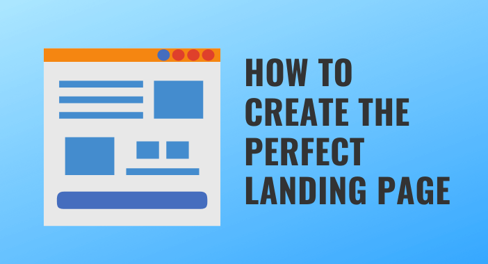
Many factors go into creating a perfect landing page, most of which have to do with the overall design of your website. Marketers may need help to determine what constitutes the best landing page.
Study these simple steps to creating a great landing page:
1. Focus on One Goal
The first step in creating a perfect landing page is to focus on one goal. Your landing page should have one primary objective, whether it’s to make a sale, generate leads, or get visitors to sign up for a newsletter. By focusing on one goal, you can make your message clear and concise.
2. Use Strong Headlines
Start with an engaging headline that offers your product or service without giving too much information. “We create money for you” is appropriate for many businesses, but some may prefer something more specific, such as “Get paid to write emails” or “Say goodbye to your workstation!”
3. Write a description
In the next section of the page, write a summary of your offer (usually below the headline). It is where you explain why people should be interested in your product or service and convince them that it will solve their problem (s)
4. Include an eye-catching image.
Include graphics showcasing your business and products/services so visitors can get a visual sense of what they’re signing up for before clicking through!
- Include images and videos, but only if they are related to what you’re offering. Make use of high-quality photos and graphics.
5. It has to be optimized for search engines.
To help it appear in Google searches, use relevant headings, keywords, and meta descriptions. Have you considered how to increase traffic to your website?
- Try these tips: Know your keywords, craft a compelling headline, fine-tune your URL, and use meta descriptions like a banner. These suggestions can significantly improve traffic to your website.
6. Have a clear call-to-action (CTA).
A clear call-to-action can mean the difference between sales and no sales. You want them to know what they should do and to do it right away.
- Make your call to action clear and concise so that no one is left wondering what to do next after reading your content.
7. Highlight benefits, not features.
Customers prefer to avoid buying a quarter-inch drill. They are interested in a quarter-inch hole. What are the benefits highlighted for the audience on the landing page?
- Imagine browsing a website for an eBook, and you come across these descriptions. Which will catch your interest? Website 1: “Get 500 free audiobooks on Economics.” Website 2: “Become a Pro in Economics.”
- Of course, everyone will choose website 2. People are concerned with the value they will get rather than how many you can offer.
8. Include Social Proof
Social proof is a powerful tool that can help you build trust with your visitors. Include testimonials, case studies, and customer reviews on your landing page to show that other people have had success with your product or service.
A landing page is required to convert the most random visitors into target leads. It explains what we want visitors to do and why they should do it for us. Have a clear message on your page with good design to give visitors a great visual impression, and you’ll make more sales!

